Note: This post was originally published on medium.
As a long time R user that has transitioned into Python, one of the things that I miss most about R is easily generating diagnostic plots for a linear regression. There are some great resources on how to conduct linear regression analyses in Python (see here for example), but I haven’t found an intuitive resource on generating the diagnostic plots that I know and love from R.
I decided to build some wrapper functions for the four plots that come up when you use the plot(lm) command in R. Those plots are:
- Residuals vs. Fitted Values
- Normal Q-Q Plot
- Standardized Residuals vs. Fitted Values
- Standardized Residuals vs. Leverage
The first step is to conduct the regression. Because this post is all about R-nostalgia I decided to use a classic R dataset: mtcars. It’s relatively small, has interesting dynamics, and has categorical both continuous data. You can import this dataset into python pretty easily by installing the pydataset module. While this module hasn’t been updated since 2016, the mtcars dataset is from 1974, so the data we want are available. Here are the modules I’ll be using in this post:
import matplotlib.pyplot as plt
from matplotlib import rcParams
import pandas as pd
import statsmodels.api as sm
import statsmodels.formula.api as smf
from statsmodels.nonparametric.smoothers_lowess import lowess
import numpy as np
import scipy.stats as stats
from pydataset import data
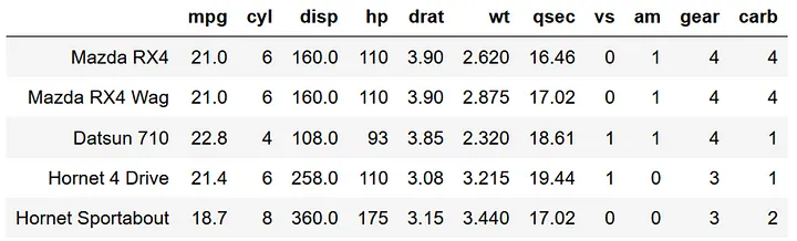
Now let’s import the mtcars dataframe and take a look at it.
mtcars = data('mtcars')
mtcars.head()
The documentation for this dataset can be accessed via the command:
data('mtcars', show_doc = True)
In particular I’m interested in predicting miles per gallon (mpg) using the number of cylinders (cyl) and the weight of the car (wt). I hypothesize that mpg will decrease with cyl and wt. The statsmodels formula API uses the same formula interface as an R lm function. Note that in python you first need to create a model, then fit the model rather than the one-step process of creating and fitting a model in R. This two-step process is pretty standard across multiple python modules.
Importantly, the statsmodels formula API automatically includes an intercept into the regression. The raw statsmodels interface does not do this so adjust your code accordingly.
model = smf.ols(formula='mpg ~ cyl + wt', data=mtcars)
results = model.fit()
print(results.summary())
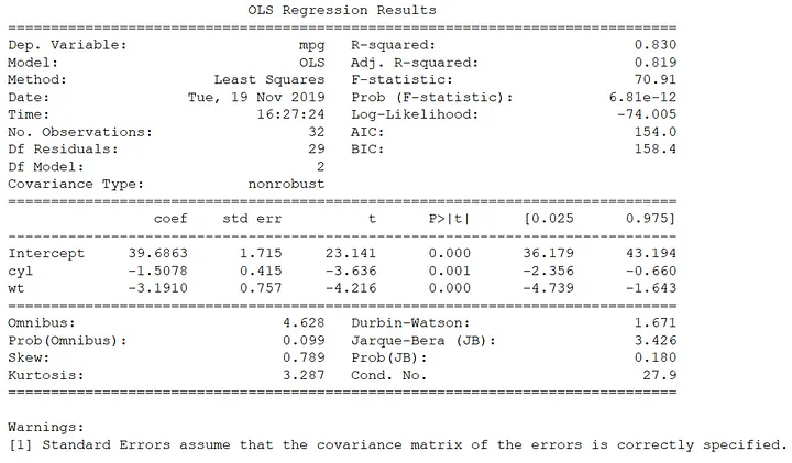
The amount of variance explained by the model is pretty high (R^2 = 0.83), and both cyl and wt are negative and significant, supporting my initial hypothesis. There is plenty to unpack in this OLS output, but for this post I’m not going to explore all of the outputs nor discuss statistical significance/non-significance. This post is all about constructing the outlier detection and assumption check plots so common in base R.
Do the data fit the assumptions of a OLS model? Let’s get to plotting!
First, let’s check if there is structure in the residuals relative to the fitted values. This plot is relatively straightforward to create. The plan here is to extract the residuals and fitted values from the fitted model, calculate a lowess smoothed line through those points, then plot. The annotations are the top three indices of the greatest absolute value of the residual.
residuals = results.resid
fitted = results.fittedvalues
smoothed = lowess(residuals,fitted)
top3 = abs(residuals).sort_values(ascending = False)[:3]

plt.rcParams.update({'font.size': 16})
plt.rcParams["figure.figsize"] = (8,7)
fig, ax = plt.subplots()
ax.scatter(fitted, residuals, edgecolors = 'k', facecolors = 'none')
ax.plot(smoothed[:,0],smoothed[:,1],color = 'r')
ax.set_ylabel('Residuals')
ax.set_xlabel('Fitted Values')
ax.set_title('Residuals vs. Fitted')
ax.plot([min(fitted),max(fitted)],[0,0],color = 'k',linestyle = ':', alpha = .3)

for i in top3.index:
    ax.annotate(i,xy=(fitted[i],residuals[i]))

plt.show()
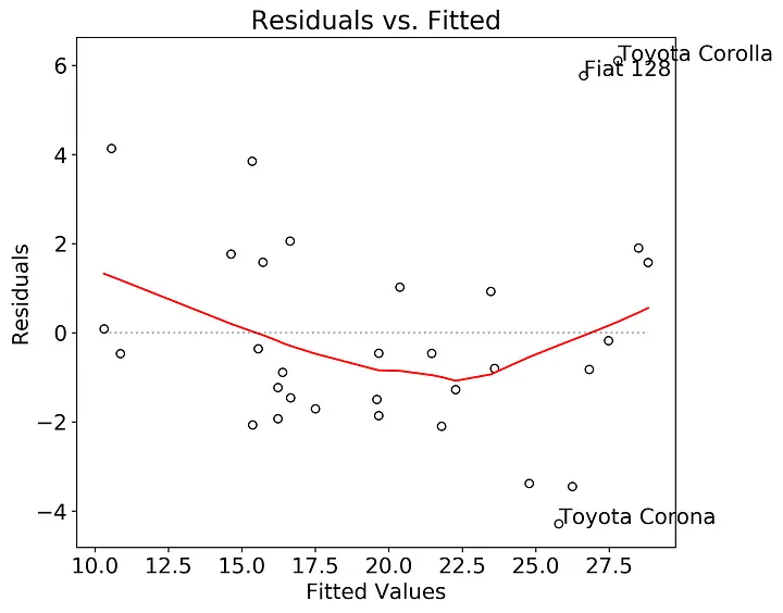
In this case there may be a slight nonlinear structure in the residuals, and probably worth testing other models. The Fiat 128, Toyota Corolla, and Toyota Corona could be outliers in the dataset, but it’s worth further exploration.
Do the residuals follow a normal distribution? To test this we need the second plot, a quantile - quantile (Q-Q) plot with theoretical quantiles created by the normal distribution. Statsmodels has a qqplot function, but it’s difficult to annotate and customize into a base R-style graph. Not to worry, constructing a Q-Q plot is relatively straightforward.
We can extract the theoretical quantiles from the stats.probplot() function. I used the internally studentized residuals here since they’ll be needed for the third and fourth graph, but you can use the raw residuals if you prefer. Then we’ll plot the studentized residuals against the theoretical quantiles and add a 1:1 line for visual comparison. The annotations are the three points with the greatest absolute value in studentized residual.
sorted_student_residuals = pd.Series(results.get_influence().resid_studentized_internal)
sorted_student_residuals.index = results.resid.index
sorted_student_residuals = sorted_student_residuals.sort_values(ascending = True)
df = pd.DataFrame(sorted_student_residuals)
df.columns = ['sorted_student_residuals']
df['theoretical_quantiles'] = stats.probplot(df['sorted_student_residuals'], dist = 'norm', fit = False)[0]
rankings = abs(df['sorted_student_residuals']).sort_values(ascending = False)
top3 = rankings[:3]

fig, ax = plt.subplots()
x = df['theoretical_quantiles']
y = df['sorted_student_residuals']
ax.scatter(x,y, edgecolor = 'k',facecolor = 'none')
ax.set_title('Normal Q-Q')
ax.set_ylabel('Standardized Residuals')
ax.set_xlabel('Theoretical Quantiles')
ax.plot([np.min([x,y]),np.max([x,y])],[np.min([x,y]),np.max([x,y])], color = 'r', ls = '--')
for val in top3.index:
    ax.annotate(val,xy=(df['theoretical_quantiles'].loc[val],df['sorted_student_residuals'].loc[val]))
plt.show()
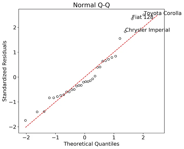
Here we can see that the residuals all generally follow the 1:1 line indicating that they probably come from a normal distribution. While difficult to read (just like in base R, ah the memories) Fiat 128, Toyota Corolla, and Chrysler Imperial stand out as both the largest magnitude in studentized residuals as and also appear to deviate from the theoretical quantile line.
Now we can test the assumption of homoskedasticity using the scale-location plot. Base R plots the square root of the “standardized residuals” against the fitted values. “Standardized residuals” is a bit vague so after searching online, it turns out “standardized residuals” are actually the internally studentized residuals. As I showed above, extracting the internally studentized residuals from the fitted model is straightforward. After that we’ll take the square root of their absolute value, then plot the transformed residuals against the fitted values. If the scatter in the plots is consistent across the entire range of fitted values, then we can safely assume that the data fit the assumption of homoskedasticity. I’ve annotated for the three largest values of the square root transformed studentized residuals.
student_residuals = results.get_influence().resid_studentized_internal
sqrt_student_residuals = pd.Series(np.sqrt(np.abs(student_residuals)))
sqrt_student_residuals.index = results.resid.index
smoothed = lowess(sqrt_student_residuals,fitted)
top3 = abs(sqrt_student_residuals).sort_values(ascending = False)[:3]

fig, ax = plt.subplots()
ax.scatter(fitted, sqrt_student_residuals, edgecolors = 'k', facecolors = 'none')
ax.plot(smoothed[:,0],smoothed[:,1],color = 'r')
ax.set_ylabel('$\sqrt{|Studentized \ Residuals|}$')
ax.set_xlabel('Fitted Values')
ax.set_title('Scale-Location')
ax.set_ylim(0,max(sqrt_student_residuals)+0.1)
for i in top3.index:
    ax.annotate(i,xy=(fitted[i],sqrt_student_residuals[i]))
plt.show()
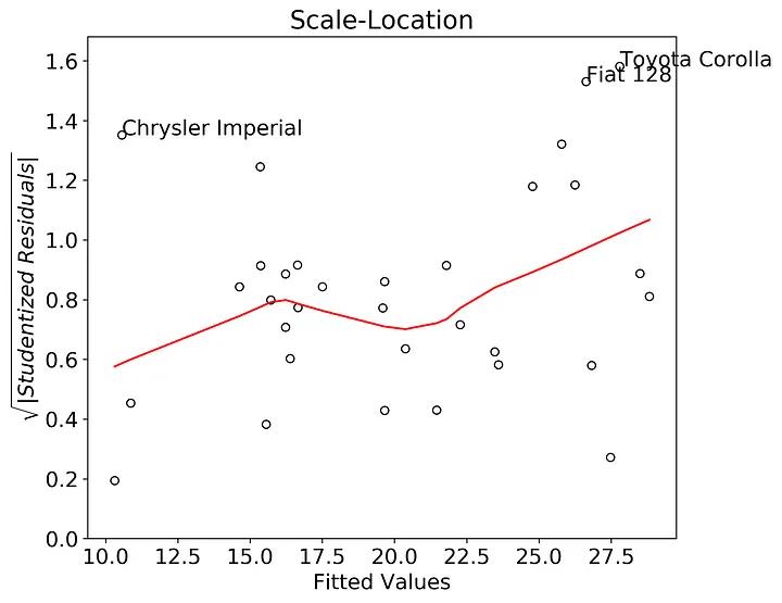
In this case there appears to be an upward trend in the lowess smoother. This could be indicative of heteroskedasticity. This heteroskedasticity would probably be worse if I removed the Chrysler Imperial point, so this assumption could be violated in our model.
Finally, I constructed the residuals vs. leverage plot. The response variable is again the internally studentized residuals. The x-axis here is the leverage, as determined via the diagonal of the OLS hat matrix. The tricky part here is adding in the lines for the Cook’s Distance (see here on how to construct these plots in seaborn). The annotations are the top three studentized residuals with the largest absolute value.
student_residuals = pd.Series(results.get_influence().resid_studentized_internal)
student_residuals.index = results.resid.index
df = pd.DataFrame(student_residuals)
df.columns = ['student_residuals']
df['leverage'] = results.get_influence().hat_matrix_diag
smoothed = lowess(df['student_residuals'],df['leverage'])
sorted_student_residuals = abs(df['student_residuals']).sort_values(ascending = False)
top3 = sorted_student_residuals[:3]

fig, ax = plt.subplots()
x = df['leverage']
y = df['student_residuals']
xpos = max(x)+max(x)*0.01
ax.scatter(x, y, edgecolors = 'k', facecolors = 'none')
ax.plot(smoothed[:,0],smoothed[:,1],color = 'r')
ax.set_ylabel('Studentized Residuals')
ax.set_xlabel('Leverage')
ax.set_title('Residuals vs. Leverage')
ax.set_ylim(min(y)-min(y)*0.15,max(y)+max(y)*0.15)
ax.set_xlim(-0.01,max(x)+max(x)*0.05)
plt.tight_layout()
for val in top3.index:
    ax.annotate(val,xy=(x.loc[val],y.loc[val]))

cooksx = np.linspace(min(x), xpos, 50)
p = len(results.params)
poscooks1y = np.sqrt((p*(1-cooksx))/cooksx)
poscooks05y = np.sqrt(0.5*(p*(1-cooksx))/cooksx)
negcooks1y = -np.sqrt((p*(1-cooksx))/cooksx)
negcooks05y = -np.sqrt(0.5*(p*(1-cooksx))/cooksx)

ax.plot(cooksx,poscooks1y,label = "Cook's Distance", ls = ':', color = 'r')
ax.plot(cooksx,poscooks05y, ls = ':', color = 'r')
ax.plot(cooksx,negcooks1y, ls = ':', color = 'r')
ax.plot(cooksx,negcooks05y, ls = ':', color = 'r')
ax.plot([0,0],ax.get_ylim(), ls=":", alpha = .3, color = 'k')
ax.plot(ax.get_xlim(), [0,0], ls=":", alpha = .3, color = 'k')
ax.annotate('1.0', xy = (xpos, poscooks1y[-1]), color = 'r')
ax.annotate('0.5', xy = (xpos, poscooks05y[-1]), color = 'r')
ax.annotate('1.0', xy = (xpos, negcooks1y[-1]), color = 'r')
ax.annotate('0.5', xy = (xpos, negcooks05y[-1]), color = 'r')
ax.legend()
plt.show()
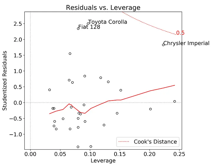
There is some evidence in this plot that the Chrysler Imperial has an unusually large effect on the model. Which makes sense given that it’s an outlier at the minimum edge of the possible range of fitted-values.
If you are interested in creating these diagnostic plots yourself, I created a simple module (OLSplots.py) that replicates the plots shown above. I’ve hosted this module as well as the Jupyter notebook for conducting this analysis on my github repository.
Some guidelines:
- If you are using a test-train split for your regressions, then you should run the diagnostic plots on the trained regression model before testing the model.
- The current module cannot handle a regression done in sklearn, but they should be relatively easy to incorporate at a later stage.
- The OLSplots.py module currently has no error messages built in, so you’ll need to debug on your own. That being said, if you pass a fitted OLS model from statsmodel into any function, it should work fine.
- The text annotations are the index values for the pandas dataframe used to construct the OLS model, so they will work for numeric values as well. Thanks for reading. That’s all for now!
Further Reading